
SAE SIL JAE brand identity
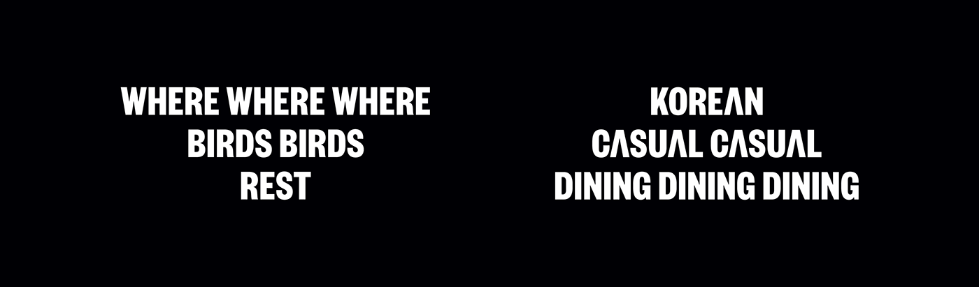
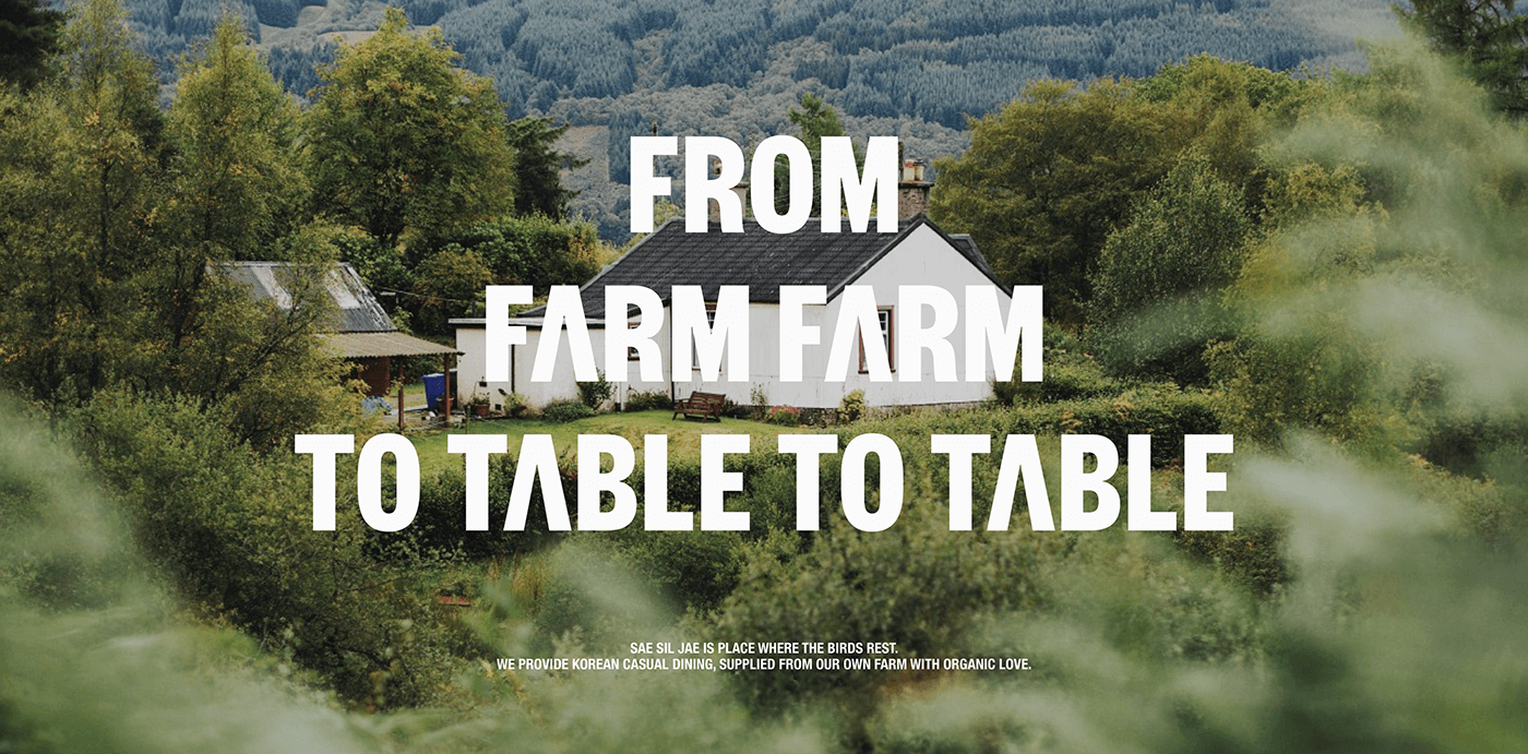
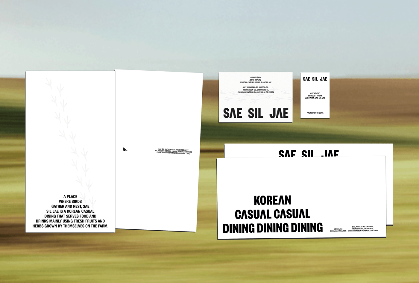
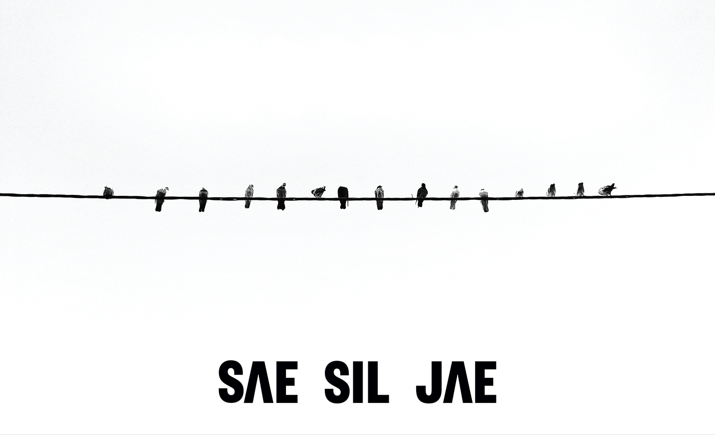
SAE SIL JAE, a place where birds gather and rest, is a korean casual dining that serves food and drinks mainly using fresh fruits and herbs grown by themselves on the farm.

Context of Design
The meaning of "SAE SIL" has been taken from the Saesil Village farm where birds have been gathered together for a long time, and the meaning of "JAE," which means a valley, was added to contain the meaning of "a valley where birds gather.” Just as birds come to the village with ease, eat, drink, and take a rest, it contains SAE SIL JAE's will to provide a place where visitors can fill their stomachs and chill.


Visual Identity
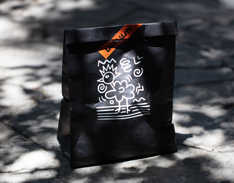
We wanted to deliver a consistent visual experience by borrowing the layout of birds, roofs, hills, and valleys. In addition, for visuals that fit the context of casual dining, we consistently created a very casual, bold, and playful typographic and layout. On top of that, by developing a bird, the mascot of the SAE SIL JAE, we also strengthened friendliness by utilizing the visual on the alphabet A that looks like a roof. In the space, we also tried to create an atmosphere of coming home and relaxing by utilizing wood-tone interiors, yellow indirect lightings, and white-oriented tablewares.